Data storytelling means turning complicated data into an interesting, easy-to-understand story. As data becomes more important everywhere, being able to share what it really means is crucial.
Data storytelling is the skill of taking lots of data and making it into a story people can engage with. Good data stories use facts, visuals, and a narrative that flows. This makes the data feel relevant so people understand and remember it.
Well-done data stories don’t just present information. They get people to take action by making the data feel meaningful. In today’s data-driven world, data storytelling is an essential skill. It helps explain what insights the data analysis shows. Learning data storytelling is valuable for anyone working with data.
The Basics of Data Storytelling
At its core, data storytelling involves using data to support a meaningful narrative. It goes beyond just visualizing data to using data to convey a compelling story. Here are some key elements of effective data storytelling:
- Focusing on the audience – Know who you’re speaking to and what matters to them. Craft the narrative to resonate with their interests and goals.
- Establishing context – Provide the backstory and explain why the insights matter. Don’t assume familiarity with the topic or data.
- Using a logical, easy-to-follow structure – Lead readers through the data insight by insight to gradually reveal the key takeaways.
- Highlighting critical data – Draw attention to the most important data points that support the narrative. Other non-essential data should be excluded.
- Utilizing a variety of visuals – Augment the narrative with charts, graphs, illustrations, and other visuals that illuminate findings.
- Conveying emotions and importance – Storytelling elements like narrative tension, conflict, and resolution help convey the meaning and impact of the data findings.
- Providing concise conclusions – Recap the key takeaways and explain why they matter to readers. Leave them with clear insights.
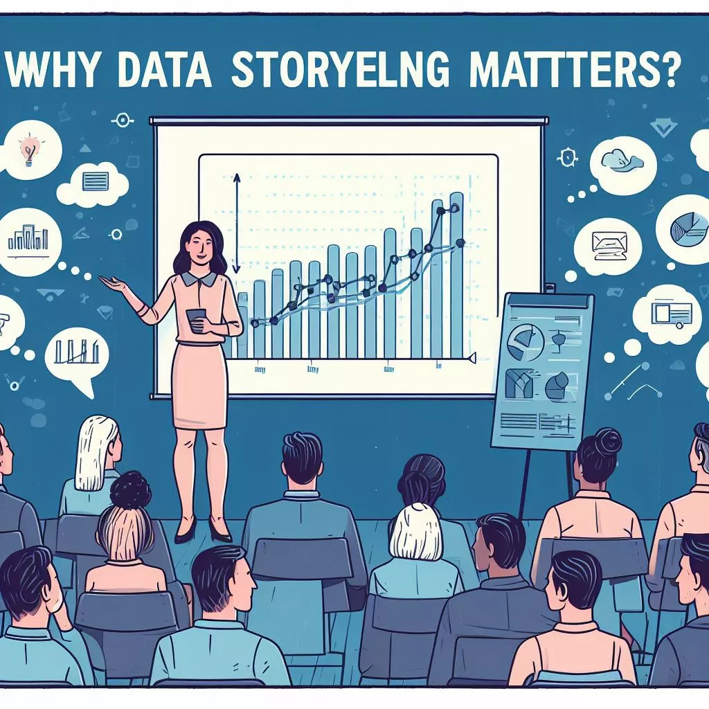
Why Data Storytelling Matters
With the rising prominence of data in business and society, the ability to give data meaning through impactful storytelling is more important than ever. Here are some of the key reasons why data storytelling matters:

- Humanize complex data – Numbers and charts alone can fail to resonate. Storytelling presents data insights in a relatable way for broader audiences.
- Prompt action on insights – Compelling narratives motivate people to take action in a way raw data rarely does. Good storytelling translates insights into initiatives.
- Build understanding and recall – Stories help convey complexity, provide context, and aid memory in a way bulleted insights cannot.
- Captivate audiences – A compelling narrative keeps audiences engaged as it walks them through key findings and implications.
- Democratize data access – Storytelling makes data insights accessible to a broader non-technical audience for better data literacy.
- Spark collaboration – Stories promote discussion, debate, and problem-solving rather than passive data consumption.
- Justify decisions – Backing up strategies with data-driven stories provides rationale and context for business decisions.
- Drive change – Storytelling gives meaning to data and motivates people to rethink assumptions, perspectives, and actions.
Key Elements of Data Storytelling
Now that we’ve covered the basics, let’s look at some of the foundational elements that comprise effective data storytelling.
Finding the Story in the Data
The first step is mining datasets to uncover potential stories to tell. This involves:
- Identifying patterns, trends, and anomalies. What’s expected vs unexpected?
- Summarizing findings and highlighting key relationships between variables.
- Determining what findings are most relevant to the audience. What’s impactful and meaningful?
- Discerning correlations vs causations. Are we observing real connections?
- Relating findings to the big picture. Do they confirm or refute assumptions?
Focusing the Narrative
With a story angle identified, the narrative must be fleshed out and focused:
- Establishing plot – What’s the beginning, middle, and end? How will the story unfold?
- Defining purpose – What should readers learn and why does it matter?
- Outlining structure – How will findings logically build on each other?
- Choosing a point of view – Is it first person or third person? Consistency matters.
- Identifying protagonists – Who are the heroes or villains? Whose story is it?
Storyboarding Visuals
Next, determine which data visualizations will best complement the narrative:
- Clarify relationships – Use scatter plots, heat maps, network diagrams
- Compare changes over time – Illustrate with line graphs, bar and slope charts
- Convey proportions – Pie charts, treemaps, stacked bars, and pillars
- Locate patterns in complexity – Scatter plots and cluster mapping
- Show correlation – Use scatter plots and bubble charts
Drafting the Data Story
With the story structure and visuals mapped out, it’s time to bring the data story to life:
- Write conversationally – Use everyday language, not technical jargon.
- Provide context first – Explain the backstory before diving into data findings.
- Describe insights simply – Use clear analogies and avoid cluttering explanations.
- Use storytelling elements – Incorporate anecdotes, dialog, and conflict and resolution.
- Emphasize the impact – Drive home why the insights matter and what could happen next.
- Cite data appropriately – Source facts without letting citations clutter the narrative.
- Fact-check rigorously – Validate accuracy to build reader trust and avoid undermining credibility.
Refining the Story
The final step is reworking drafts based on feedback:
- Check narrative flow – Make sure the story is logical, transitions are smooth, and the sequence makes sense.
- Ensure visualizations complement the storyline – Align charts seamlessly with the narrative rather than allowing them to feel disconnected or forced.
- Watch audience reactions – Gauge listeners’ responses to see where they are engaged or confused.
- Review for clarity – Check that explanations and descriptions are clear and easy to absorb.
- Balance details with brevity – Cut any unneeded intricacies while still providing context.
Enhancing Data Storytelling with Data Visualization
Data visualization plays a pivotal role in data storytelling. Here’s how it enhances your storytelling:
- Revealing Patterns and Trends: Visualizations uncover data patterns and trends objectively.
- Providing Context: Visuals help interpret results and provide context, making the data narrative more accessible.
- Streamlining Data: Visualizations simplify data for easier comprehension and retention.
- Improving Engagement: Engaging visuals make your data story more compelling and memorable.
One effective way to present visualizations is through data dashboards. Dashboards consolidate critical information, offering better visibility into trends, enhancing forecasting accuracy, identifying key performance indicators, and enabling real-time analytics.
AI Art vs Human Art: Exploring the Great Debate
Data Storytelling Examples
To illustrate effective data storytelling, let’s look at a few examples:

New York Times: Mapping America’s Mortality Divide
The New York Times visualized life expectancy data across U.S. regions in a story titled “Mapping America’s Mortality Divide.”
The narrative guides readers through life expectancy insights county-by-county. By progressing from broad overview maps to granular county-specific views, they build a case that your longevity depends heavily on where in the U.S. you live.
The visuals provide emphasis and mirror the story’s progression from macro to micro. Clear written explanations accompany each view of the data. It humanizes an abstract concept like life expectancy by making the impacts tangible.
Google: Using Data to Fight Coronavirus
Google’s data-driven storytelling about using mobility data to fight COVID-19 highlights how its analytics are supporting public health policy.
The story combines annotated charts with narrative explanations of how reporting on mobility trends helps inform the pandemic response.
This shows how data storytelling can make data sets relatable while demonstrating the value of analytics. The focus remains on what the insights mean versus just discussing the data.
BBC: Climate Change and Chocolate
In this BBC article, data storytelling explains climate impacts on cocoa production.
It leads with the relatable hook that climate change may alter the taste of chocolate. Visuals on cocoa-suitable areas make modeling data easy to grasp quickly. Narrative context builds empathy for farmers bearing the brunt of these environmental shifts.
This example shows how data storytelling can stir interest, increase understanding, and appeal to emotions with qualitative elements. The data insights tell a story grounded in human experiences.
Best Practices for Data Storytelling
Now that we’ve covered key principles and components of data storytelling, let’s outline some best practices to hone your skills:

- Know your audience – Tailor data stories to resonate with the interests and level of data literacy of your target readers or listeners.
- Lead with relevance – Hook audiences by first addressing “Why does this matter to me?” before diving into data details.
- Focus on clarity over complexity – Avoid overwhelming readers. Keep explanations clear and concise even if it means simplifying some nuances.
- Use engaging visuals – Charts and illustrations should enhance the story. Avoid visual clutter that distracts rather than informs.
- Blend qualitative elements – Combine data-driven narrative with storytelling techniques like anecdotes, dialogue, and conflict.
- Follow the data – Let objectivity steer the narrative. Don’t force stories from data. Instead, allow insights to emerge.
- Provide context – Help audiences interpret data by explaining relevant historical, social, or political factors at play.
- Be transparent – Address any data limitations or uncertainties so audiences can interpret insights appropriately.
- Choose your medium – Know when data stories work best as visualizations, presentations, blog narratives, videos, podcasts, etc.
- Iterate and optimize – Refine data stories based on feedback and engagement analytics to improve resonance.
The Future of Data Storytelling
Data storytelling is a constantly evolving art. As technology expands the data available and improves visualization capabilities, new frontiers are opening up. Here are some emerging trends to watch:

- Virtual and augmented reality – Immersive 3D data visualizations and simulations will provide radical new storytelling mediums.
- Artificial intelligence – AI can help automatically produce basic data narratives and visuals for storytellers to refine.
- Specialized platforms – New tools purpose-built for data storytelling will aid wider adoption. Examples include Databook and Datawrapper.
- Integrating big data sources – Real-time data feeds from IoT and other big data sources provide more diverse data pools to drive stories.
- Quantifiable narrative impact – Advanced analytics will allow more precise measurement of how data stories change opinions, prompt actions, and achieve defined goals.
The possibilities for innovation in data storytelling are endless. As data’s role in society grows, the need for compelling data communication will only intensify. That makes this an exciting time for anyone eager to tell their data’s story.
Here are some software options for data visualization and infographics:
- Tableau: Tableau is known for its intuitive interface and robust data visualization capabilities. It empowers users to craft interactive and easily shareable dashboards, charts, and graphs. Its proficiency in handling substantial datasets has made it a preferred choice among data professionals.
- Power BI: Power BI is a Microsoft product included in Office 365. It’s a versatile tool for creating interactive visualizations and reports. It integrates seamlessly with Microsoft products and offers extensive data connectivity options.
- Google Charts: Google Charts, a web service seamlessly integrates with Google Sheets data simplifying the process of creating a range of charts and graphs. While it may not offer advanced features as some competing tools, its user-friendly interface and customization options make it a convenient choice, for users.
- Infogram: Infogram stands out as a web-based infographic maker tailored to streamline the process of crafting visually appealing infographics. Featuring an extensive template library and intuitive tools, it’s an ideal choice for individuals who aren’t design experts but seek to present data attractively
- Visme: Visme is another web-based infographic maker that goes beyond infographics. It enables users to create presentations and other visual content in addition to infographics. Visme offers various features for customization and design.
Books:
- Storytelling with Data: A Data-Driven Approach to Persuasion by Cole Nussbaumer Knaflic
- Data Stories: Telling Stories with Data to Persuade Audiences by Brent Dykes
- The Wall Street Journal Guide to Information Graphics: The Dos and Don’ts of Presenting Data and Statistics by Dona M Wong
- Narrative Visualization: Telling Stories with Data by Edward Segel and Jeffrey Heer
- Information Dashboard Design: Effective Visual Communication of Data by Stephen Few
MOOC courses:
- Data Storytelling with Cole Nussbaumer Knaflic (Coursera)
- Data Visualization and Storytelling with Tableau (Udemy)
- Data Storytelling: The Art and Science of Telling Stories with Data (edX)
- Data Visualization for Storytelling and Discovery (Knight Center’s Journalism Courses)
- Data Storytelling for Business (StoryIQ)
These resources, including books and courses, will equip you with the foundational skills required for data storytelling. Learn how to collect and analyze data, construct a compelling narrative, and employ visuals to convey your message with precision.
Conclusion
Telling stories with data is a great way to get people to understand and act on complicated information. It turns data into stories that stick with people. Good data stories use words, images, and facts together. This makes the data feel meaningful so people get the point and make smarter choices.